http://flowingdata.com/2014/06/24/burger-place-geography/
This week I decided to use flowingdata to find a news story and to critique it.
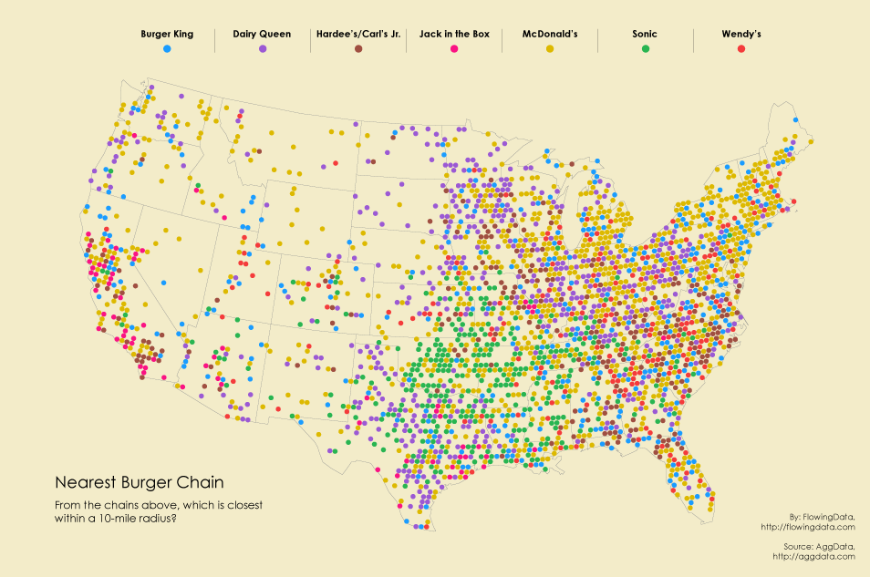
The story I found talks about the different fast food burger places in the United States. I thought this was a great thing to do because it shows the amount of fast food chains on the map of the United States.

I think this can cause people to rethink the amount of fast food we allow in our lives.
Another good thing this website did was show all the fast food chains in this country. With the growing problem of obesity I think this chart can really get across to people.
I think it was also interesting to see based on their geographical settings which type of fast food people in the USA like and how it differs across the country.
I believe this map was better than a chart because it really shows how over run this country is with fast food.
It shows the numerical amount in different maps below just this one and it also shows the growth of the food chains in the country
I believe that the only thing that could make it better would have been to show different countries not just the United States for a greater emphasis. Over all though, this website definetely gets it's pint across and I believe it did a great job
No comments:
Post a Comment